Help - problems with understanding the historical plot?
The series of satellite observations of snow cover presented on this page spans from the winter of 2004/05 to the current winter. For practical reasons, the historical data has been divided into annual periods, with each displayed on separate charts. Each winter is represented by two charts.
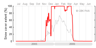
The chart on the left is analogous to the one on the main page. It shows the daily extent of snow cover in the country (red line) against the backdrop of an "average" winter. The values on the vertical axis indicate the percentage of surface covered with snow. Zero percent means no snow cover at all, while one hundred percent means the entire country is covered in snow.
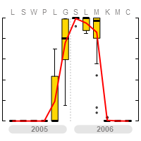
The chart on the right does not show daily data but rather monthly averages (the letters above the chart are the first letters of the months, starting with July and ending with June). By averaging the daily values, most information about the dynamics of snow cover changes is lost. However, it provides a synthetic overview of the winter. Climatologists typically work with monthly average values of different parameters.
The generalized information is presented in the form of so-called box plots. These allow not only the average value for a given month to be illustrated (here expressed as the median, the black horizontal line within the yellow rectangle), but also the variability of values within the month. The yellow rectangle shows the range in which 50% of the values fall. The black line extending from the rectangle represents the range covering about 90% of all observations. The black circles outside the black line are outliers—the highest and lowest values observed in that month. You can read more about this type of chart at http://en.wikipedia.org/wiki/Box_plot. The red line connects the average monthly values of snow cover extent, this time expressed as the arithmetic mean.