How satellite sees snow?
Attention! Only for the brave! The following text, while written in a popular science style, contains spine-chilling scientific terms and even one formula. What's worse, the length of the text exceeds three sentences, requiring several minutes of focused attention.
If we were to briefly answer the question of how a satellite "sees" snow, the response might be surprising: satellites don’t see snow. Meteorological satellites "see" only electromagnetic radiation. This radiation is a signal, sometimes visible and sometimes not, emitted by all objects around us. Everything emits radiation — mountains, clouds, oceans, people, stars, air, computers. The warmer the object is, the more radiation is emmited. Different objects can also reflect and absorb radiation differently. Modern satellite observations of Earth involve analyzing electromagnetic radiation.
Satellite instruments used for snow research measure the intensity of this radiation. They do not measure air temperature, precipitation, wind speed, or any properties of the snow cover. The satellite's role is simply to record radiation within a specific spectrum range (e.g., visible, microwaves, infrared) and transmit the measurements to Earth. Scientists then step in to interpret whether a particular measurement indicates the presence of snow or something else. So, satellites see only radiation, and scientists detect snow by analyzing the characteristics of that radiation.
To better understand this, let’s follow the process of satellite snow observation step by step. We will use data from the MODIS instrument on the Terra satellite, which has been in orbit since late 1999. Terra is one of the three flagship satellites of the U.S. environmental research program for the "Blue Planet." Constructing and launching this five-ton satellite cost the U.S. $1.3 billion, with another $0.5 billion spent on mission operations over the following years. Terra orbits Earth at about 700 km altitude, completing one orbit in approximately 98 minutes.
On January 10, 2011, at 11:10 AM Polish time, Terra was passing over Europe. MODIS sensor observed a significant part of the Europe, including Poland (Fig. 1). MODIS was operating at full capacity and, within five minutes, conducted approximately 100 million measurements of radiation emitted or reflected by Earth's surface (land, oceans, atmosphere). MODIS records radiation in 36 spectral ranges—or, to simplify, 36 colors — most of which are invisible to the human eye. Let’s focus on six ranges that cover shortwave radiation. This is solar radiation reflected by Earth and eventually detected by the satellite.
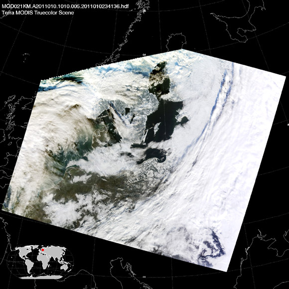
Fig. 1. A satellite image of Europe captured by the MODIS instrument on the Terra satellite on January 10, 2011. This is roughly how Earth's surface would appear to a human observer at an altitude of 700 km.
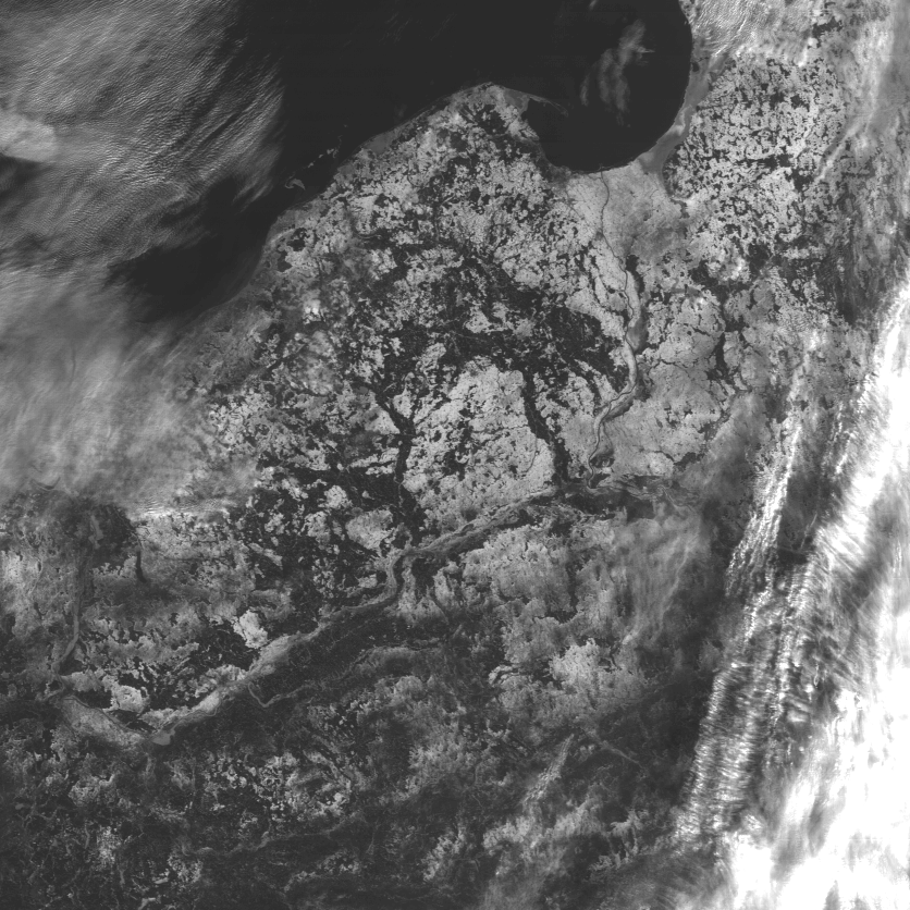
Let’s transform raw data into graphics (Fig. 2). Each image is a graphical representation of numerical data from a different spectral range. Low radiation values are displayed as black, high values as white, and intermediate values as shades of gray. This is how a "satellite photo" is created. Why is it black and white? Isn’t a $1.6 billion satellite capable of taking color photos? Quite the opposite. A color image is created by combining any three black-and-white images. Since there are 36 black-and-white images, you could try calculating how many color combinations are possible.
 |
 |
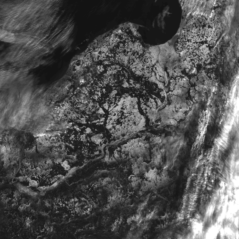 |
| 469 nm | 555 nm | 645 nm |
 |
 |
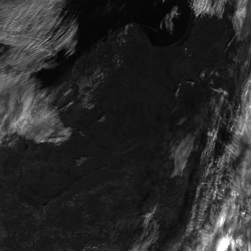 |
| 859 nm | 1240 nm | 1640 nm |
|
Fig. 2. The images represent data from six separate spectral ranges. The top row corresponds to visible radiation, which is also perceived by our eyes (a color composition of these would result in an image similar to Fig. 1). The bottom row shows information from near-infrared radiation, which is invisible to the human eye. Click the images to enlarge. |
Now, let’s select four points in Poland and examine how much radiation was detected from them by the satellite. Raw satellite data indicate absolute radiation levels, expressed in watts per square meter, per micrometer, per steradian. Confused? These units are indeed abstract for most people. Instead, let’s use relative radiation information, which represents the fraction of reflected radiation. How does this work? If a surface reflects all incoming radiation, the fraction is 1 (or 100%). If it absorbs all the radiation, reflecting none, the fraction is 0 (or 0%). Thus, values range from 0% (all absorbed) to 100% (all reflected).
The table 1 lists radiation reflection values from various surfaces at four selected points. Each point corresponds to a single pixel in the image, representing a 500x500 meter square on the ground. The measured radiation is the average for the entire square. The points were selected so that each pixel was entirely filled with one surface type (homogeneous). Can you determine the type of surface for each point? Could any of these points be snow? Is it even possible to answer these questions just by looking at the numbers in the table?
|
Wavelenght
|
point A
|
point B
|
point C
|
point D
|
|
0.47 micrometer
|
14.3
|
14.1
|
3.7
|
4.6
|
|
0.56 micrometer
|
13.4
|
16.3
|
2.1
|
3.2
|
|
0.65 micrometer
|
13.6
|
15.8
|
1.3
|
2.4
|
|
0.86 micrometer
|
14.1
|
14.1
|
0.6
|
5.5
|
|
1.2 micrometer
|
3.7
|
14.7
|
0.4
|
4.1
|
|
1.6 micrometer
|
0.6
|
9.6
|
0.1
|
1.4
|
The Answer Lies in Physics. You can observe that the reflection values for points A, B, C, and D differ. These differences arise because, due to their structure and physical properties, each object reflects radiation in its unique way — snow, water, clouds, grass, and trees all behave differently. This is why the world is colorful, and why remote sensing has strict physical foundations (distinguishing it from photo-interpretation, which involves understanding a satellite image solely by looking at it).
The differences in reflection and absorption of radiation by various objects allow us to define an "electromagnetic fingerprint." Once we have this fingerprint, we can, like a detective, compare the reference fingerprint with the one found at the "scene of the crime" to determine what object reflected the radiation. Let’s look at the electromagnetic fingerprint of snow (Fig. 3). It’s evident that snow reflects a significant amount of radiation in the visible spectrum (wavelengths from 0.4–0.7 micrometers). Interestingly, the reflection is uniform across all wavelengths in this range. What does this mean? Snow is white!
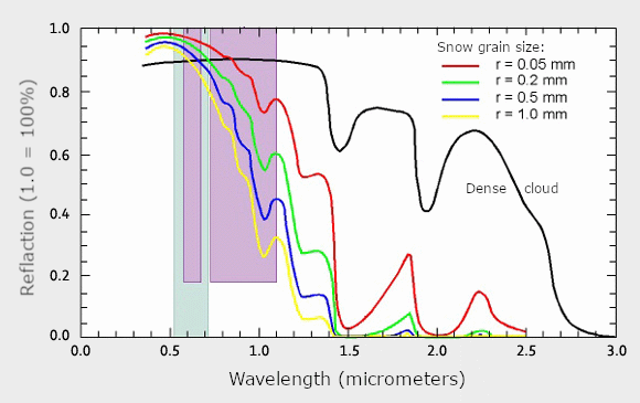
Fig. 3. Reflection Intensity of Solar Radiation by Snow Changes with Wavelength. For short wavelengths (visible range, 0.4–0.7 micrometers), reflection is very strong. It weakens as the wavelength increases: at 1.6 micrometers, snow absorbs almost all radiation. The colored lines represent snow with different grain sizes. The black line shows reflection for a cloud — like snow, it is bright in the visible range, but unlike snow, it remains bright in the near-infrared range. Compare this graph with the images in Fig. 2.
As we move toward the near-infrared, beyond 0.8 micrometers, the amount of reflected radiation drops rapidly. Reflection decreases fastest for snow made of large grains (yellow line) and slowest for fine-grained snow (red line). For wavelengths of 1.6 and 2.0 micrometers, snow reflects very weak radiation. If our eyes were sensitive to this range, snow would appear black! Now, look back at Fig. 1. Do you see regions in Poland that were white in the visible spectrum but turn black in the 1.6-micrometer range? That’s where snow is present.
The electromagnetic fingerprint of snow (Fig. 3) was developed in a laboratory using high-resolution spectrometric measurements. It’s like scanning snow with a sensor not limited to 36 bands but hundreds or thousands of spectral ranges. Unfortunately, meteorological satellite sensors used for Earth observation have only a few spectral bands. MODIS, for instance, has 36. We must work with less detailed information, like that shown in Fig. 4 (data from Table 1 represented as a graph).
Even with only six spectral bands, we can capture the characteristic points of the reference curve (from the laboratory). Snow is most easily confused with clouds, which are equally bright (equally white) in the visible range. However, clouds remain relatively bright in the infrared range (e.g., at 1.6 micrometers, they still reflect a lot of radiation). In contrast, snow, as we’ve seen, absorbs almost all radiation at 1.6 micrometers.
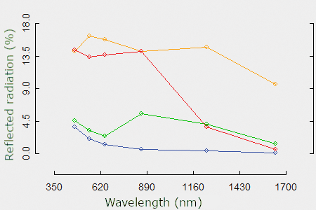
Fig. 4. The intensity of radiation reflection for four points from Table 1. The curve for point C is marked in blue. In every spectral range, the object from point C strongly absorbs solar radiation, most intensely in the infrared. These properties characterize water – point C is located in the Gulf of Puck. Slightly brighter, especially in the near-infrared, is the object located in point D (green line). It represents vegetation without snow cover. MODIS is now observing it during its “winter sleep.” With the arrival of spring, photosynthetic activity of plants will increase and the reflectance curve will change slightly - it will move up the graph. The brightest object, in any spectral range, is the object from point B (orange line). At the latitude of Poland, only clouds are this bright, and it is on them that point B is located. The last curve (red color, point A in Table 1) indicates an object that strongly reflects visible radiation but also strongly absorbs infrared radiation. This stands in clear contrast to vegetation, water, and clouds. The red line corresponds to snow.
If we were to design a sensor exclusively for snow observation, two spectral ranges would suffice: one covering wavelengths from 0.68–0.76 micrometers and another from 1.6–1.8 micrometers. The first range would help differentiate snow from vegetation and water, while the second would separate snow from clouds. The effectiveness of this choice is well illustrated in Fig. 5.
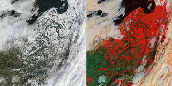
Fig. 5. Color combinations of spectral information. On the left, an image simulating the colors visible to our eyes from orbit. On the right, artificial colors created by selecting spectral channels that highlight the presence of snow.
The radiation recorded by the sensor in the mentioned two ranges can be compared not only graphically but, more importantly, numerically. Let us not forget that we are working with numbers (radiation intensity, reflection), and graphics are just a very convenient and illustrative way of visualizing these numbers. How can two ranges be compared quantitatively? For example, by adding them together, subtracting one from the other, and then dividing the result of the subtraction by the result of the addition. This creates something that scientists call the NDSI (Normalized Difference Snow Index), which indicates regions of snow cover:
NDSI = (visible range - infrared range) / (visible range + infrared range),
where the visible range is radiation in the 0.68–0.76-micrometer interval, and the infrared range refers to waves approximately 1.6–1.8 micrometers long. In practice, the exact boundaries of the intervals may vary slightly, but it is essential to include some visible range and some infrared range in the formula, with the infrared range corresponding to a band of strong radiation absorption by snow. According to Fig. 3, this would be somewhere around 1.5 micrometers or 2.0 micrometers.
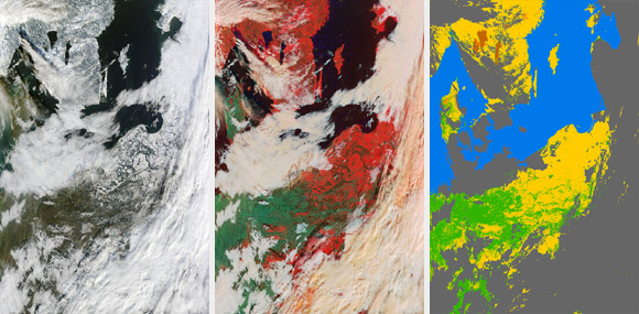
Fig. 6. Image in natural and artificial colors and the final result of MODIS data analysis – a snow cover map. Yellow indicates the presence of snow, gray indicates the presence of clouds (under which there may also be snow, but we cannot determine this). The sea is marked in blue, and snow/ice-free lakes are shown in orange.
NDSI is at the heart of most algorithms detecting the presence of snow. For instance, it is used in the algorithm developed for the MODIS sensor. The final result of the algorithm’s work is a thematic map (Fig. 6) – each pixel is assigned to one of the predefined classes: “snow,” “land,” “clouds,” or “water.” In Fig. 6, areas covered by snow are marked in yellow. And that’s it. Step by step, we analyzed satellite data, supported by physics. From relatively raw and somewhat abstract satellite data (watts per square meter per micrometer...), we arrived at a comprehensible map with four colors.
Thematic maps, obtained several times a day from MODIS, AVHRR, VIIRS, SEVIRI, and many other sensors, form the basis for creating daily snow cover extent maps of the entire Earth. The information they contain is invaluable for studying climate variability and changes. Based on such data, scientists at the Space Research Centre of the Polish Academy of Sciences monitor, among other things, the extent of snow cover in Poland. Some results of these studies are presented on this website: https://snow.cbkpan.pl/en/.